The production of nim Creative Studio logo animation.
MINIMALISTIC
The name “nim” gives off an impression of “Simple”, “Neutral”, and “Minimalistic”. From there, it envisions itself as “a collection able to adapt and transform into anything”. This is the origin of how the logo design became based on “Simple” “Neutral” and “Minimalistic” traits.
SPACE & UNIQUENESS
The logo is characterized by the transformed rectangular shapes of 5 objects, deriving from taking the space between each of the letters within “nim” as a motif.
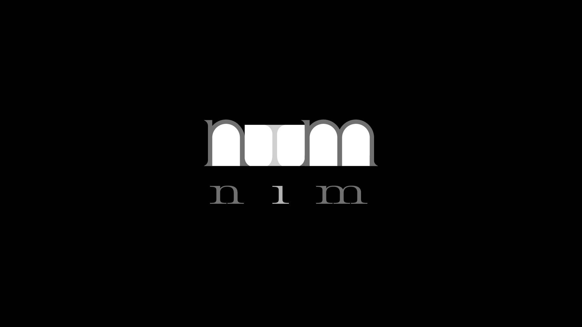
Each of these is an individual shape, but through changing perspectives, they form a completely new shape. “nim” is a representation of a collection of unique individuals.
Besides the logo mark itself, we’ve also produced a design with English letters in consideration of its readability.
Once society is able to instantly recognize “nim” through the gaps, that would be the day when “nim” had been discovered by the world.


A SPIRITUAL NEW DESIGN
People are always looking for what they have never seen before. We open new doors in hopes to come across a design that touches our hearts.
Mimicking the motion of opening a door with layers of divine and majestic sounds, this represents the expectation of something new will occur. The synthetic sound created by an analog synthesizer will resonate with anyone’s heart.
By making sure the logo’s entrance and formation are in tune mathematically, this design is able to connect the geometrical design and organic sound.
UNBOUND
The transforming motion of these 5 rectangular shapes expresses nim’s flexibility.
By changing the logo’s color or music composition, this design is able to complement various content formats.
