The production process of the logo design, screen design, film direction, and BGM used in Crazy Raccoon Cup (CR Cup).
Crazy Raccoon Cup is a gaming tournament organized by the pro-gaming team “Crazy Raccoon” for the purpose of expanding the world of esports. It is an online event that features those active in various fields of work such as pro-gamers, streamers, creators, and talents.
The Evolution of Our Pride
CR Cup prides itself on being one of the most viewed eSports entertainment show in Japan. The total viewership count exceeds 500,000 at times.
However, even when its viewer count rivaled those of official tournaments, its designs and film direction had undergone virtually no change since its debut. As CR Cup marked its monumental 10th tournament for their most popular genre “Crazy Raccoon Cup Apex Legends”, we took this opportunity to rebrand the logo design, screen design, film directions, and its BGMs.
Symbol
CR Cup’s new logo design is based off of a rocket motif, placing an importance on a symbolic design that could be used in various social media settings. It is composed of the alphabet “C” and “R” and a triangle to represent a three-person team, embodying the concept of aiming for the top with companionship.
The logo and background are made so that the color could be changed to match different game titles and tournaments. By adding a slight variance to color for each tournaments, viewers are able to tell the newest and most current ongoing game through social media headers and icons.
Its simple and iconic composition allows this logo to be used as an arrow on a transition scene or a decoration part on a screen.
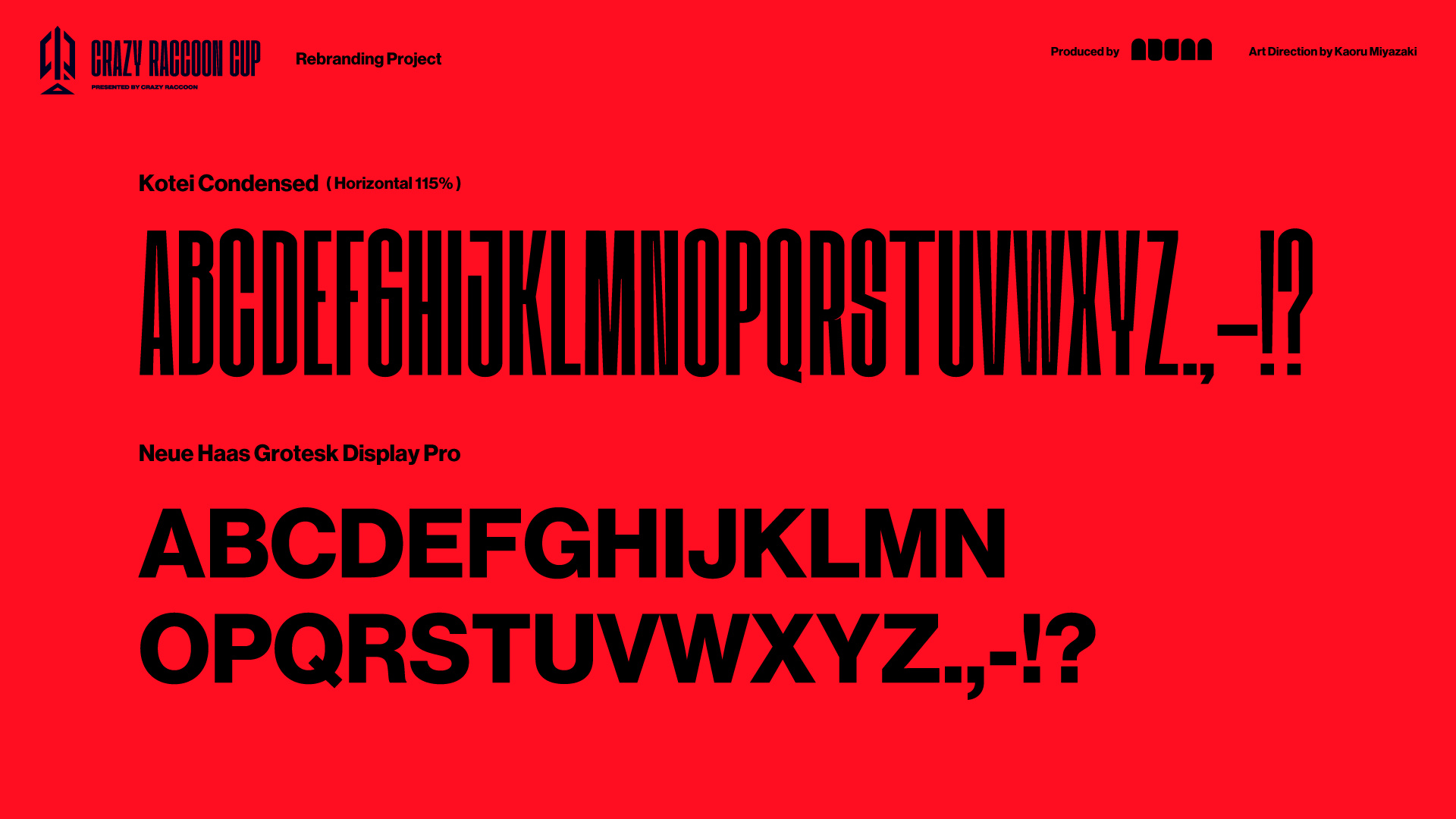
For the fonts, we selected one that was elongated vertically to match the logo, giving it an energetic feel. This elongated text is used in various stream screens and social media pictures, effectively becoming a part of CR Cup’s identity. We’ve also added a sub font of Neue Haas Grotesk Display Pro to support readability.
Sophisticating and Inheritance
In general, we focused on “Visibility, Beauty, Coolness” for our stream screens. By using the elongated font from the logo for captions, we ensured a sense of unity throughout. Additionally, much like the logo, these screens could be used in other game titles by changing its color. In some places, we’ve added in square designs, but these are passed on from the previous CR Cup designs, as they were used frequently in backgrounds.
We also used 3DCG in backgrounds to create the “seven-colored rainbow prisms”, illustrating the idea of the tournament being one of the biggest in Japan. Using the three-dimensional symbol logos, we dissected it into a glass-like material object.
In these slide contents, we’ve limited the number of animation curves we used to give a senes of unity, making it very versatile in any situation. I’m
Glowing Resonance
In the waiting screen BGM, we used music that resembled a trailer of a film, topped with a calm electronic music to stimulate expectations and anxiousness for the tournament.
For BGM used in commentary and champion screens, we used a fast tempo of BPM 150. Creating contrast from the calm waiting screen BGM, we wanted to create a moment of exhilaration and nostalgia, referencing typical MMORPG music. For our sound effects, we placed great importance on making it hold up to the complex graphics and its momentum. In particular, for the champion screen, we purposefully let the sound crack to create that feeling of refreshment when accomplishing something great. Furthermore, by using the same scale note as the BGM, we made sure the music sounded tonal when layered upon each other.